
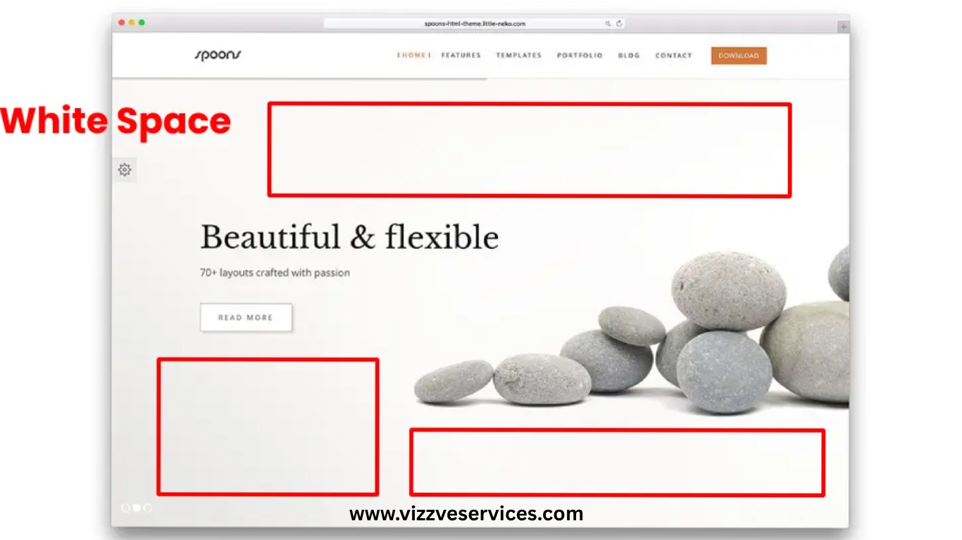
The Importance of White Space in Design and Web Design
In the realm of design and web development, white space—also known as negative space—is a critical yet often overlooked element. It refers to the unmarked areas between design elements, such as margins, paddings, and spaces between text and images. While it might seem like empty space, white space plays a pivotal role in enhancing user experience, readability, and overall aesthetics.
What is White Space?
White space is the portion of a page left unmarked, encompassing the space between graphics, margins, gutters, and space between columns, lines of type, or figures. It's not necessarily white; it can be any color, texture, or pattern that serves to separate and organize content.
Types of White Space
- Micro White Space: This refers to the small gaps between elements like letters, lines of text, and buttons. It's crucial for text legibility and overall readability.
- Macro White Space: These are larger spaces between major layout elements, such as the space surrounding images or blocks of text. Macro white space helps in structuring content and guiding the user's eye through the design.
Importance of White Space in Design and Web Design
- Enhances Readability and Comprehension:
Proper use of white space between lines and paragraphs can increase comprehension by up to 20%. It allows users to process information more efficiently by reducing cognitive load. - Improves User Experience:
A clean, uncluttered design makes it easier for users to navigate and find information, leading to a more satisfying user experience. - Creates Visual Hierarchy:
White space helps establish a clear visual hierarchy, guiding users to the most important elements first, such as calls to action or key messages. - Conveys Sophistication and Elegance:
Designs with ample white space often appear more upscale and refined. Luxury brands frequently use white space to convey a sense of exclusivity and high quality. - Focuses Attention:
By surrounding key elements with white space, designers can draw attention to specific areas, making them stand out and encouraging user interaction. - Enhances Aesthetic Appeal:
White space contributes to a balanced and harmonious layout, making designs more visually appealing and easier on the eyes.
Best Practices for Utilizing White Space
- Prioritize Content: Determine the most important elements and ensure they have enough surrounding space to stand out.
- Maintain Consistency: Use consistent spacing throughout the design to create a cohesive look and feel.
- Responsive Design: Ensure that white space adapts appropriately across different screen sizes for optimal user experience on all devices.
- Avoid Overcrowding: Resist the urge to fill every inch of space. Allowing elements to breathe can make the design more effective and engaging.
Conclusion
White space is far from wasted space; it's a fundamental component of effective design and web development. By thoughtfully incorporating white space, designers can create layouts that are not only aesthetically pleasing but also functional and user-friendly. At Vizzve Services, we understand the power of white space and leverage it to craft designs that resonate with users and achieve business goals.
www.vizzve.com || www.vizzveservices.com
Follow us on social media: Facebook || Linkedin || Instagram